Simple by design
Three clicks or fewer.
That is the target for every everyday action. Here is what it looks like in practice, and where there is still work to do.
The rule I set myself
If a job people do every week takes more than three clicks, the design is wrong. So each page puts its common actions right on the row where you need them, and the rest of the screens follow one shared pattern.
| I want to… | How | Clicks |
|---|---|---|
| Pause a device's internet | Devices, then Pause on its row | 2 |
| Always give a device the same address | Devices, then Keep address on its row | 2 |
| Turn a route off | Routes, then Turn off on its row | 2 |
| Pause a firewall rule for a while | Firewall, Rules, choose a time in Pause… | 3 |
| Start any new policy | Create policy, choose the kind, then fill in the form and Save | 3, plus typing a name |
Being honest: this is a goal that is built into the design and met by most everyday jobs, and there are still places that take more. Opening a port, for example, takes a few taps more than I would like, and some settings pages are deeper than they should be. They are on the list.
One form for everything
Learn it once.
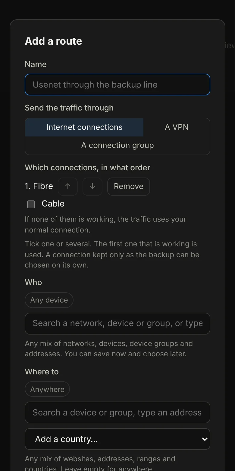
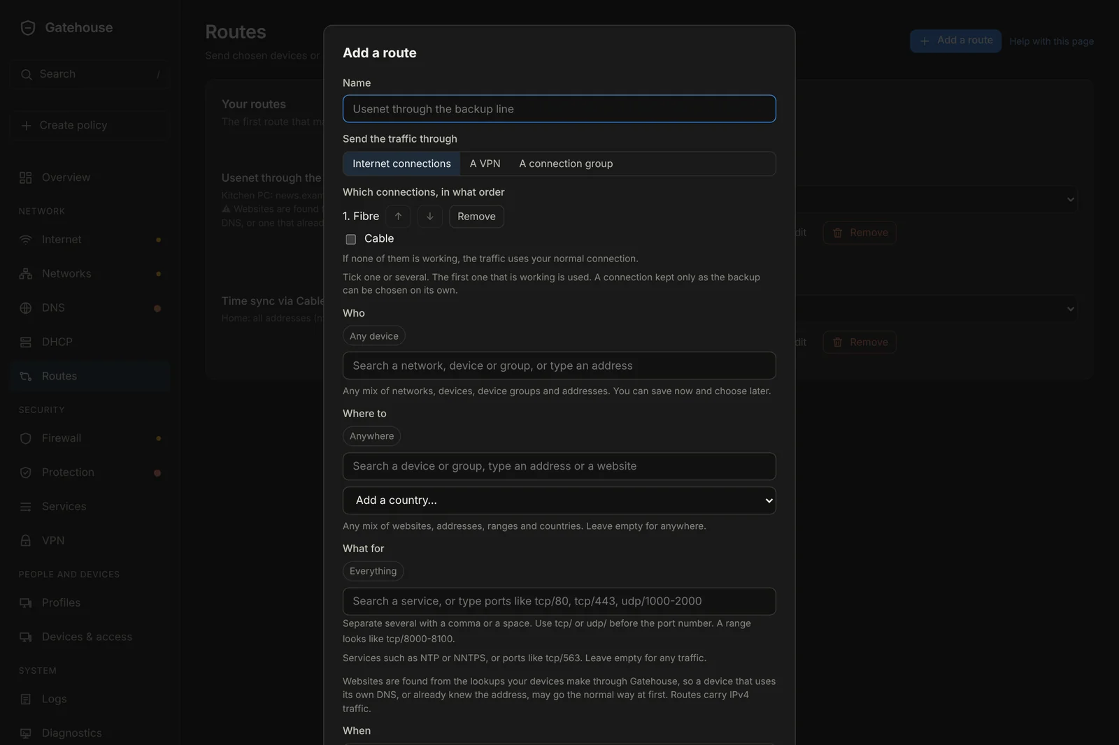
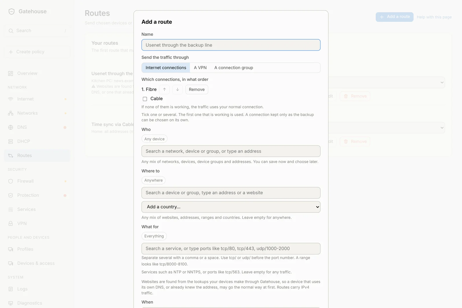
New in 0.9.1, every kind of policy uses the same four questions:
Who?Pick networks, devices, groups or addresses.
Where to?Websites, addresses or whole countries.
What for?A named service like NTP, or ports.
When?Always, or on a schedule.
Controls that are always the same
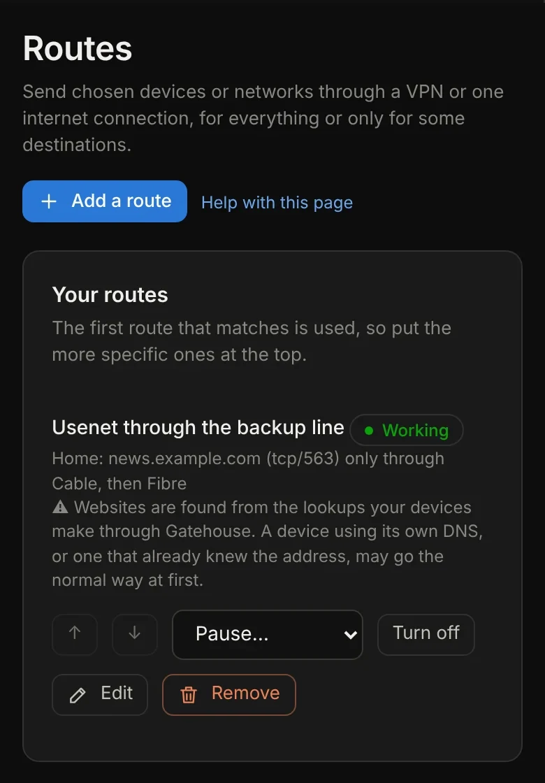
Every rule, route, block and port forward has the same row of controls with the same words, so you never have to hunt for them.
Pause…
For a set time, or until you resume.
Turn off
Keep it without using it.
Edit
Change anything about it.
Remove
Gone, with a few seconds to undo.
And it works on your phone
Forms and lists rearrange themselves for small screens, so you can fix something from the sofa.